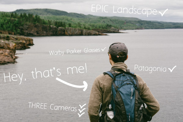
So you want to learn how to edit Instagram photos?
My name’s Josh Haroldson, and over the last 15 years, I’ve spent thousands of hours taking and editing photos that have been featured in some cool places (like Food+Wine, Design Sponge, being named an Instagram Suggested User (@joshharoldson)), and for some great brands on Instagram like Lands’ End, Graduate Hotels, and the Grand Ole Opry.

Now, a lot of photographers won’t tell you this, but my photos rarely look amazing right after I take them. And they definitely don’t look like the photos I post on Instagram. (Sound familiar?)
And even if they don’t admit it, the same is true for all of the pros, influencers, home bloggers, and fashion bloggers who get thousands of likes and comments.
Which is a GREAT thing for you! Because it means you already have a ton of photos in your camera roll that are just a few simple steps away from looking amazing.
And in this post, I’m going to be sharing the critical 20% of what I’ve learned about how to edit Instagram photos so you can get started right now using just a couple (free or nearly free) apps like VSCO.
Primary Tools Used:
Photo Editing Apps
Adobe Lightroom CC ($9.99 / mo), VSCO (iOS, Android), Instagram (iOS, Android), Adobe Photoshop Fix (iOS Only)
Cameras and Lenses Used:
Sony A6000 (plus 50mm f/1.8 lenses), Nikon D5100 (plus Nikon 35mm f/1.8, 50mm f/1.8D, 55-200mm f/4-5.6 lenses), Apple iPhone 6S.
#1:
Camera: iPhone 6S
Location: Hubbard Avenue Diner, Middleton, WI
Software: VSCO / Instagram
Click here to see the post.
EDITS
VSCO:
- Preset C6 +7
- Exposure +3
- Contrast +2
Instagram:
- Brightness +10
- Contrast +25
- Horizontal Perspective: +2.5
NOTES
I took this photo while Stasia and I were having brunch at Hubbard Avenue Diner in Middleton, WI (blueberry pancakes…a treat we don’t often indulge in). The thing I love about this photo is that to me it is the quintessential snapshot. Just my phone and the natural light. But, you can see how the edit brought this from just a little too dark to a more accurate representation of the feeling in the room which was bright, happy, and full of life.
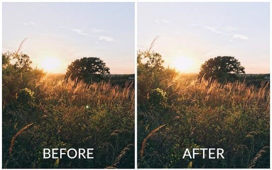
#2:
Camera: iPhone 6S
Location: Henry Vilas Beach, Madison, WI
Software: VSCO / Instagram
Click here to see the post.
EDITS
VSCO:
- Preset E6 +3
- Exposure +2
- Contrast +2
- Clarity +1
- Cropped slightly and straightened
NOTES
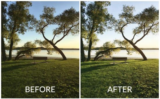
Golden Hour. As always, when you have such great light not much needed to be done to this photo which is why I so lightly applied the filter here. However, while getting better each iteration, the iPhone isn’t the best at capturing dynamic range (roughly the variation between the amount of light and dark that can be captured in the same photo). So, I need to bring up the exposure a little in order to not have the foreground be too dark. But, when you increase the exposure that can wash out the dark areas. So, typically whenever I increase the exposure, I also add a little bit of contrast to balance out the image and add back in some dynamic range.
#3:
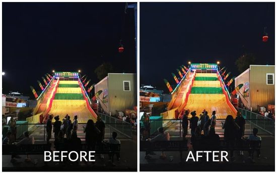
Camera: iPhone 6S
Location: 2016 Minnesota State Fair, St. Paul, MN
Software: VSCO / Instagram
Click here to see the post.
EDITS
VSCO:
- Preset C8 +10
- Exposure +2
- Highlights Save +1
- Shadows Save +1
- Contrast +1
- Clarity +1
- Cropped, straightened, vertical perspective changed
NOTES
Editing night photos taken on an iPhone gets pretty tricky. The darker areas can tend to have a lot of noise if you get too aggressive with your filter (that tends to lighten shadows) or by adding in exposure. In this case, I used VSCO C8 because it tends to darken the image and give everything a nice dark / saturated tone which fits perfectly with the neon lights. Clarity also helps to add a little bit of sharpness to the image without making it look grainy.
#4:
Camera: iPhone 6S
Location: Raymond Ridge Park, Madison, WI
Software: VSCO / Photoshop Fix / Instagram
Click here to see the post.
EDITS
VSCO:
- Preset E6 +9
- Slight crop
Adobe Photoshop Fix:
- Removed light artifact (aka bright green spot)
NOTES
Once again Golden Hour comes through. Sometimes great light does almost all the work for you. In this case, I still wanted to use a subtle filter to lightly lower the saturation and brighten the image for Instagram. I find that Instagram often slightly darkens my images when I upload so often I’ll add a little extra brightness before hitting share. The real star of this edit however is my favorite spot removal tool, Adobe Photoshop Fix. This thing honestly works better than my desktop version of Photoshop / Lightroom for spot removal. It is that good.
#5: Guest Photographer @stasiaharoldson
About Stasia Haroldson:
For this first week, I had to include my wife Stasia. She’s pretty new to photography and editing, but in a couple of short months, she’s come a long way! It has been really exciting to watch her learn and last weekend I was especially proud when The Everygirl re-grammed the picture she’s sharing today!

Camera: iPhone 6S
Location: Our Home
Software: VSCO
Click here to see the post on Instagram
EDITS
VSCO:
- Preset C2 +6
- Temperature -1
- Sharpen +6
NOTES
Whenever I see pictures I am drawn to, I always try to take note of what it is I like about them. The common themes are that they are always crisp and bright. For this photo, I had some great natural light and really great colors, but I wanted it to be even more bright and striking to someone looking at it, and I wanted it to feel like they were sitting in the same spot I was when I took it. – Stasia
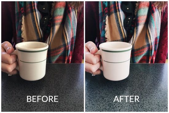
A Tip About Adobe Photoshop Fix for Spot Removal
In the past, I’ve mentioned that Photoshop Fix on my iPhone does a better job of removing spots / unwanted things from your photo (like a coffee stain on a mug or a piece of dirt on a lens).

However, I need to amend that statement because I’ve realized 1) why it worked so well and 2) a lesson to apply to spot removal in Lightroom or any other photo editing program.
I think the reason spot removal works so well in Photoshop Fix is not that the program is better, but because of how I always type “i” instead of “o” on the iPhone keyboard.
Think about it. Because you’re limited to the pretty blunt and imprecise brush that is your fingertip I always end up zooming in really far when removing something. So ironically, that actually ended up making my selection more precise and therefore making it much easier for the algorithm behind spot removal to come up with something that blended seamlessly into its surroundings.
In Lightroom, however, I was doing the exact opposite. Because I have the precision of a mouse, I would only consistently zoom in to 1:1 (100%) or maybe 2:1 (200%) if something seemed tricky. Whereas on my phone I might be zooming into the equivalent of 8:1 or more. So in that case my precision pointing instrument was being used to select an area much larger than it needed to be.
So, this week I went back to Lightroom and zoomed-in much further (think 8:1) and I’m happy to say that spot removal works even better than I thought in Lightroom and is still awesome in Photoshop Fix.
The lesson as always…never assume that the way you’ve been doing things is the way you should keep doing things! But hey, in this case you get to benefit from my mistakes!
#6:
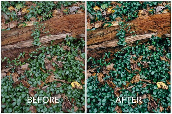
Camera: Sony A6000
Location: Baxter’s Hollow State Natural Area near Baraboo, WI
Software: Lightroom
Click here to see the post on Instagram.
EDITS
Lightroom:
- Preset: VSCO Film 05 Kodak Ektar 100
- Exposure: -.30
- Highlights / Shadows: -35 / +30
- Whites / Blacks: -30 / +30
- Saturation: -5
- Sharpening: +21
- Noise Reduction: +14 (Luminance)
NOTES
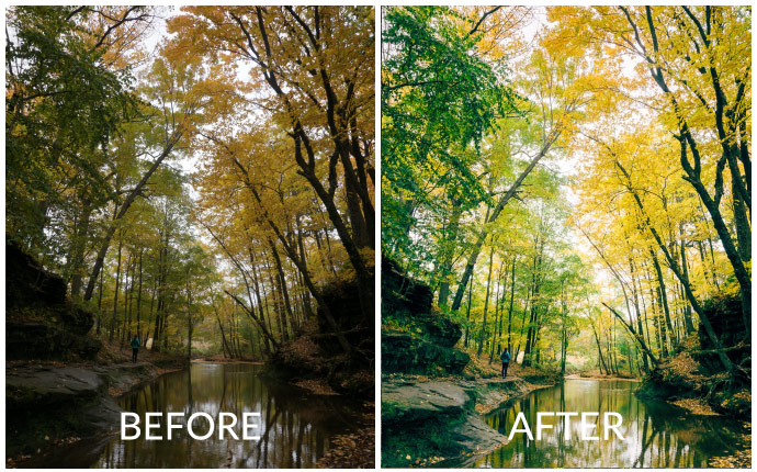
I took a photo a lot like this a few years ago at Tower Hill State Park and have that one hanging in my office. Something about the deep, dark waxy greens really speaks to me. However, as you can see those deep greens are not what came out of the camera at all! In this case, VSCO Film 05 allowed me to bring out the deep greens that the mid-day haze had washed out. Another important thing to note is the almost complete balance between lightening the shadows and darkening the highlights. Along with a slight decrease in exposure, this is what really brings out the dark spaces between the leaves without the image getting too dark. Try this the next time you’re editing in Instagram.
#7:

Camera: Sony A6000
Location: Pewits Nest State Natural Area near Baraboo, WI
Software: Lightroom
Click here to see the post on Instagram.
EDITS
Lightroom:
- Preset: VSCO Film 05 Kodak Ektar 100
- Exposure: +1.9
- Highlights / Shadows: -35 / +30
- Whites / Blacks: -30 / +15
- Saturation: -5
- Sharpening: +21
- Noise Reduction: +5 (Luminance)
Instagram:
- Brightness: +18
- Contrast: 10
- Structure: +8
- Warmth: +21
- Saturation: +6
- Highlights / Shadows: -58 / +59
- Cropped and Straightened
- Exposure
NOTES
This one is a doozy! I know there are a lot of edits here that might make it seem like I completely changed the look of this picture from real life. However, if you’ve ever taken a photo while hiking in a beautiful forest you’ve probably run into the problem of having to pick how to expose the photo. If you focus on the bright sun peeking through the leaves suddenly the whole scene becomes dark and gloomy to compensate. However, if you focus on the darker areas the whole photo becomes washed out and all those great colors are gone. So, what do you do?
On your iPhone, this is a great chance to turn on the HDR feature. It takes two images (one using the bright area and another with dark areas) and combines them into one image. This will give you a much better base to start out with.
However, as great as that feature is…this is a perfect example of how a DSLR / Mirrorless camera (in this case the Sony A6000) can do a much better job of capturing what you actually saw (or what your brain told you that you saw).
With a total ability to capture a range of light around twice your phone (combined with shooting in RAW), you end up with a much better editing pallet to do in the post what your brain does automatically (aka brighten, bring up the shadows, lower the highlights).
#8: Guest Photographer @stasiaharoldson
About Stasia Haroldson:
Real-life got in the way this week and since I’m building this on the fly, my wife gets to be the guest photographer again! The “perks” of being married to me, right Stasia? Anyway, if you want to get to know her better, why not listen to Season 1 of our podcast, Our First Drink: Conversations with Interesting Couples, where you can hear her be much funnier than me.
Camera: iPhone 6S
Location: Candlefish, Charleston, SC
Software: VSCO
Click here to see the post on Instagram
EDITS
VSCO:
- Preset C2 +7
- Temperature -1
- Sharpen +7
- Contrast +1
- Exposure +1
NOTES
“When I saw this wall of candles while visiting Charleston, SC, I was so excited – it had so much interesting detail. The challenge, though, was all the lines – each one needed to be straight in order to have the best visual impact. This is such a key part of my editing process. I do all my adjustments of this kind in the Instagram app and not in VSCO – I find Instagram to be much easier to use because of all the extra gridline levels they provide. To toggle between all the gridline options, just tap on the four “crossed” lines in the top left of the “Adjust” menu inside Instagram.”
– Stasia Haroldson
#9:
Camera: iPhone 6S
Location: Devil’s Lake State Park near Baraboo, WI
Software: Lightroom
Click here to see the post on Instagram.
EDITS
VSCO:
- Preset: A2 +9
- Contrast: +3
- Highlights Save / Shadows Save: +1 / +1
- Temperature: +1 (to bring back a little warmth)
- Saturation: -1
Instagram:
- Exposure: +31
- Highlights / Shadows: -25 / 6 (to balance out the increased exposure)
NOTES
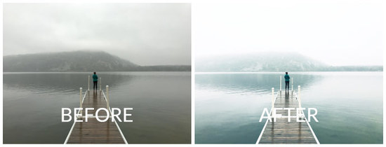
I’ve been going to Devil’s Lake for just about 8 years now and this day is definitely in the running for the most breathtaking weather. As I mentioned in the intro, even though most of the colors are past I still love getting out this time of the year because you generally have places to yourself. Even Devil’s Lake, the most visited park in Wisconsin, can be nearly deserted once the temps get chilly, the weather misty, and the air foggy.
For this edit, I really wanted to highlight the mystical (pun intended) feel of the day through the extra-bright highlights and the cool, blue-ish tones of the A2 filter (available in The Contemporary Collection in VSCO).
However, instead of turning up the exposure in the VSCO app (which limits your edits to big steps), I upped the exposure by a significant amount in Instagram so I had more control over the final look. You could also do this with the great editing tools available in the iPhone’s camera roll (click on edit looking at a picture in your camera roll to bring up the editing options).
#10:
Camera: iPhone 6S
Location: Stasia’s Mom’s House
Software: VSCO
EDITS
VSCO:
- Preset: A6 +7
- Exposure: +6
- Contrast: +3
- Shadows Save: +1
NOTES
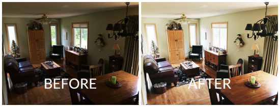
As much as I’d love to be exploring cool places all the time, the reality is my wife and I are pretty seasoned homebodies. Yes, we have our brief windows of exploration, but we’re never sad to have to return home. And that means like a lot of people, we take a ton of pictures inside. But, as beautiful as the first picture was, landscapes full of fog lend themselves to great photos.
Interiors on the other hand can be REALLY tricky to make look good. How many times have you noticed a perfect scene in your house, only to pull out the camera and just not quite be able to match how nice it felt to be there? That used to happen to me all the time until I figured out the secret to making an interior photo taken on your phone look good.
So, what’s the secret? Highlights…or more accurately…bring up the shadows.
In a professionally shot interior photo you’ve got a sensor that can capture a ton of dynamic range (aka the windows aren’t too bright and the corners aren’t too dark) and it is very often professionally lit. Now, I don’t know about you, but we don’t keep a studio light set up in the corner of the living room. And in this photo of Stasia’s mom’s sitting room, the sun had just gone behind a tree making the room just a bit darker than was convenient for the photo I wanted to take.
However, by bringing up the exposure and the shadows I was able to recapture the bright, happy feeling of the space.
TIPS:
- Try playing around with bringing the shadows up with your interior photos this weekend. A word of caution, however: In the photo above you can see that the windows were “blown out” (so bright you can’t see any detail), but that is a fine price to pay to give the overall photo the feeling I was looking for.
- Try to “tap” on the window when focusing to stop the phone from over-exposing the photo. We want to do this in the edit, not in the original photo.
- Check out a great example of this by @witanddelight_
#11:
Camera: iPhone 6S
Location: Madison, WI Capitol Square
Software: VSCO
Click here to see the post on Instagram.
EDITS
VSCO:
- Preset: C8 +6
- Straighten, Crop, and Vertical Perspective Change
- That’s it!
NOTES
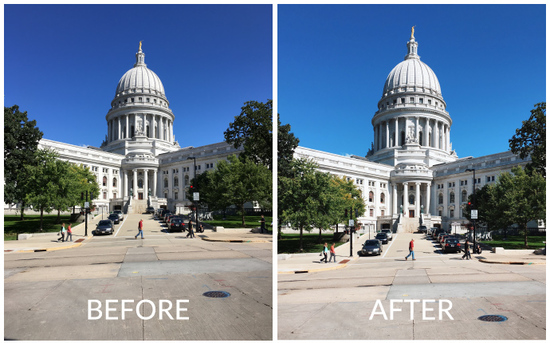
I took this photo on the Madison Capitol Square while grabbing lunch from the El Grito Taqueria truck. Not only were the tacos tasty, but the photo I got shows the power of good light. During the summer, the mid-day sun means harsh shadows and unappealing color. However, the great thing about the fall is that even mid-day light has nice “softness” to it and a bit of a golden glow. So all I needed to do was add a little filter to get the look I wanted. More important was the slight bit of vertical perspective correction that I added. Even if you don’t consciously think about it, your brain tends to notice when lines in architecture aren’t quite vertical. So next time you take a shot of a building try playing around with the perspective and see if you can notice a difference.
#12:
Camera: iPhone 6S
Location: Olin Park, Madison, WI
Software: VSCO, Photoshop Fix, Instagram
Click here to see the post on Instagram.
EDITS
VSCO:
- Preset: E6 +8
- Clarity: +1
- Exposure: +1
- Shadows Save: +1
- Contrast: +3
Instagram:
- Brightness: +8
- Contrast: +7
- Structure: +9
- Highlights: +16
- Shadows: -12
NOTES
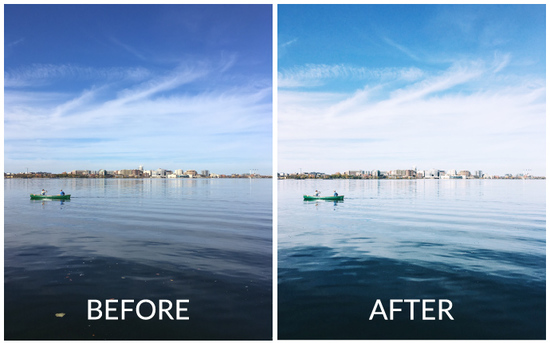
This photo on the other hand took some more effort. Although the light was gorgeous, pictures of lakes and skylines tend to get a sort of washed-out look. With a DSLR you might consider using some sort of polarizing filter (think of your sunglasses). But when I was literally stopping by the lake for 10 minutes on the way home from lunch I had to rely on my editing chops to get the look I wanted.
Ultimately I used a mix of both Shadow Save in VSCO and darkening the shadows back in Instagram in order to really bring out the dark blues of the water while still keeping a bright skyline.
The other thing you might notice is the heavy use of Photoshop Fix to get rid of the leaves in the foreground. I actually considered keeping them (they’re not bad), but ultimately I liked to a cleaner look. I think in all I got rid of over 50 spots! What do you think? Was it worth it?
#13: Tyler Anderson (@driftless.visuals)
About Tyler:
Tyler Anderson has been interested in photography for as long as he can remember. From the days when his mom handed him her Kodak with a roll of 35mm film to the present day working with a digital camera, photography has always played an important part in his life. Relocating with his wife and two children in 2014 to Lanesboro from Minneapolis gave him the opportunity to fully exercise his passion for landscape and nature photography. He feels a strong connection to the Driftless Region and his photography aims to show its unique natural beauty. With camera in hand, you’ll often find him on one of the numerous gravel roads “chasing light” for that perfect shot.

Camera: Canon t5
Lens: Canon efs 18-55mm
Shutter Speed: 1/640s
F-Stop: 5.0
ISO: 200
Location: About 5 miles southeast of Lanesboro, Minnesota
Software: Lightroom 6
EDITS
Lightroom 6:
- Temp: 4690
- Tint: +11
- Exposure: -0.05
- Contrast: -17
- Highlights: -100
- Shadows: +100
- Whites: +68
- Blacks: -100
- Clarity: +38
- Vibrance: +12
- Saturation: -6
- Highlights: -98
- Lights: -26
- Darks: +37
- Shadows: +56
- Green Saturation: -100
- Blue Saturation: -27
- All other HSL values set at 0
- Highlight Hue: 219
- Highlight Saturation: 26
- Sharpening (Amount, Radius, Detail, Masking): 143, 1.0, 25, 0
- Noise Reduction 1 (Luminance, Detail Contrast): 89, 50
- Noise Reduction 2 (Color, Detail, Smoothness): 79, 50, 50
NOTES
I had been struggling to capture the autumn tones of my area. I don’t want to shoot only “colorful leaves” in my pictures. There’s a lot more to the MN Driftless region than just pretty trees. The shades of browns, greens, and golds are numerous. In this specific area where the photo was taken, I had been shooting big landscape shots for weeks, but I couldn’t get anything I liked. Finally, I did a close-up at 42mm with a low f-stop and was very pleased with the end result.
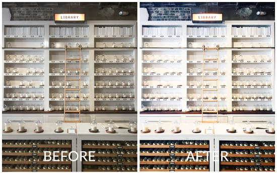
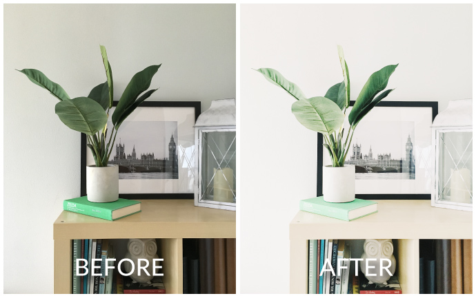
#14:
Before / After:
Apps Used: VSCO (iOS, Android)
Camera: iPhone 6S
Software: VSCO / VSCO X
EDITS
VSCO:
- Preset: FP8 +8.6***
- Character: +0.1***
- Warmth: -0.3***
- Exposure: +3.4
- Contrast: +2.6
- Straighten
- Shadows Save: +0.4
- Clarity: +0.8
***VSCO X Exclusive Feature
NOTES
Do you have a spot in your home that you love? The kind of place that you always stop and notice when you walk by?
This is one of those places for me and as a result, I’ve taken a lot of photos of this little corner over the years. It’s always fun to record the subtle changes we’ve made in the contents of the bookshelf, the plants, and the pictures on top.
More importantly, this is the kind of photo that gets taken a lot in people’s homes. A quick snapshot with, maybe, ok light.
As you can see in the Before photo, this photo was taken on an overcast day where we had some nice, flat light. However, that also meant the photo looked a little dull out of the camera which is why I made sure to add in a lot of extra exposure, plus some contrast to make sure the photo had a pleasant brightness to it.
Of course, I don’t like my interiors to get too harsh looking either (the darks too dark and the brights too bright) so just a touch of Shadow Save softens up the whole image by brightening the dark shadows just a small amount.
#15:
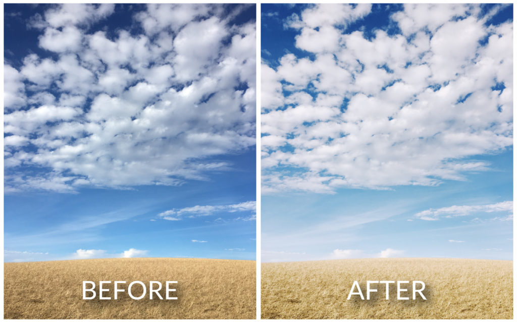
- Software Used: VSCO
- Kodak Porta 160 +7.7 (X series filter…E6 or F2 are close alternatives)
- Character +1.8 (similar to Lux +20 inside of Instagram)
- Exposure +0.4
- Shadow Save +0.1
- Clarity +0.8
That’s it! Not much needs to be done to a picture when you have such great light. However, in this case, I wanted to soften the “punchiness” to give this a more film-like quality that fit the feeling of looking at that big gold and blue horizon.
However, if you check out my Instagram post you can see I ended up adding back just a bit more contrast before I posted it (using the lux tool, a little contrast, and then bumping up the shadows a bit just to get the look exactly where I wanted it).
If you want to see the whole process from start to finish just watch this:
#16: Front Door
- Software Used: VSCO
- A6 / Analog: +8.9
- Exposure: +2.1
- Contrast: +1.7
- Clarity: +0.8
- Shadow Save: +2.3
The theme of this photo is bright! With the white walls and black door, my goal was to maximize the light white while keeping the nice deep black of the door.
So, that means a lot of Exposure and Contrast needed to be added. However, the use of Shadow Save here is key to avoid the image becoming too harsh and “contrasty”. We still want the image to feel inviting and “softening” (aka brightening) the shadows help this a ton.