Hopefully, you were able to enjoy a bit of the fall colors where you live because here in Madison they were great…but now they’re mostly gone.
I suppose that’s what makes fall so special though. It’s like my recipe for a great party. Densely packed, plenty of things to do, but just short enough that you leave everyone wanting more.
However, don’t let the passing of fall color stop you from getting outside! In fact, right now is one of the best times to get out and explore some of your favorite parks with almost zero people around…
This Week’s Edits – October 28, 2016
Life got busy so no guests this week. But I was able to work on the system for people to submit their photos and edits. I love to systemize things so I put a little work in upfront and enjoy massive benefits down the road. Stay tuned!
Apps Used This Week:
VSCO (iOS, Android), Instagram (iOS, Android)
#1:
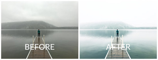
Camera: iPhone 6S
Location: Devil’s Lake State Park near Baraboo, WI
Software: Lightroom
Click here to see the post on Instagram.
EDITS
VSCO:
- Preset: A2 +9
- Contrast: +3
- Highlights Save / Shadows Save: +1 / +1
- Temperature: +1 (to bring back a little warmth)
- Saturation: -1
Instagram:
- Exposure: +31
- Highlights / Shadows: -25 / 6 (to balance out the increased exposure)
NOTES
I’ve been going to Devil’s Lake for just about 8 years now and this day is definitely in the running for the most breathtaking weather. As I mentioned in the intro, even though most of the colors are past I still love getting out this time of the year because you generally have places to yourself. Even Devil’s Lake, the most visited park in Wisconsin, can be nearly deserted once the temps get chilly, the weather misty, and the air foggy.
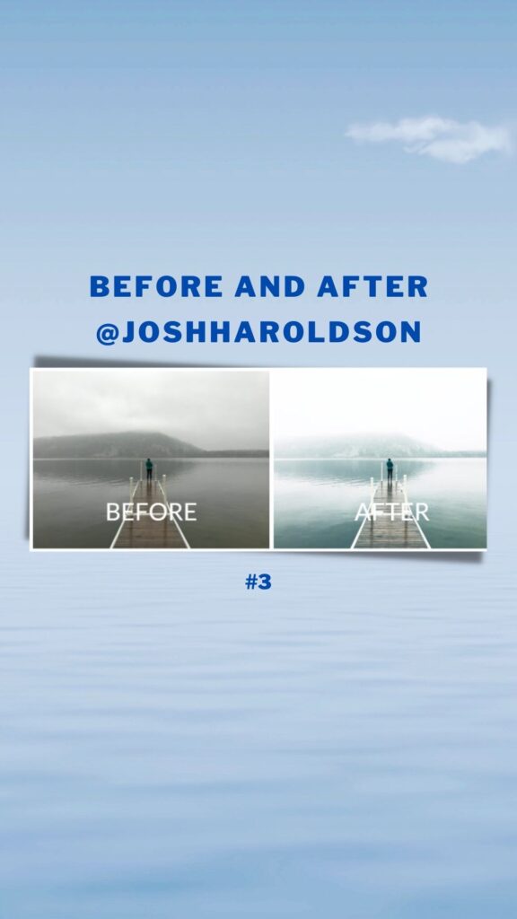
For this edit, I really wanted to highlight the mystical (pun intended) feel of the day through the extra bright highlights and the cool, blue-ish tones of the A2 filter (available in The Contemporary Collection in VSCO).
However, instead of turning up the exposure in the VSCO app (which limits your edits to big steps) I upped the exposure by a significant amount in Instagram so I had more control over the final look. You could also do this with the great editing tools available in the iPhone’s camera roll (click on edit looking at a picture in your camera roll to bring up the editing options).
#2:
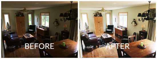
Camera: iPhone 6S
Location: Stasia’s Mom’s House
Software: VSCO
EDITS
VSCO:
- Preset: A6 +7
- Exposure: +6
- Contrast: +3
- Shadows Save: +1
NOTES
As much as I’d love to be exploring cool places all the time, the reality is my wife and I are pretty seasoned homebodies. Yes, we have our brief windows of exploration, but we’re never sad to have to return home. And that means like a lot of people, we take a ton of pictures inside. But, as beautiful as the first picture was, landscapes full of fog lend themselves to great photos.
Interiors on the other hand can be REALLY tricky to make look good. How many times have you noticed a perfect scene in your house, only to pull out the camera and just not quite be able to match how nice it felt to be there? That used to happen to me all the time until I figured out the secret to making an interior photo taken on your phone look good.
So, what’s the secret? Highlights…or more accurately…bring up the shadows.
In a professionally shot interior photo you’ve got a sensor that can capture a ton of dynamic range (aka the windows aren’t too bright and the corners aren’t too dark) and it is very often professionally lit. Now, I don’t know about you, but we don’t keep a set up studio lights set-up in the corner of the living room. And in this photo of Stasia’s mom’s sitting room, the sun had just gone behind a tree making the room just a bit darker than was convenient for the photo I wanted to take.
However, by bringing up the exposure and the shadows I was able to recapture the bright, happy feeling of the space.
TIPS:
- Try playing around with bringing the shadows up with your interior photos this weekend. A word of caution however: In the photo above you can see that the windows were “blown out” (so bright you can’t see any detail), but that is a fine price to pay to give the overall photo the feeling I was looking for.
- Try to “tap” on the window when focusing to stop the phone from over-exposing the photo. We want to do this in the edit, not in the original photo.
- Check out a great example of this by @witanddelight_
That’s it! Good luck finding a new view of your favorite summer place…or just staying home and capturing the view from your couch. Either way, enjoy your weekend!
-Josh
@joshharoldson
