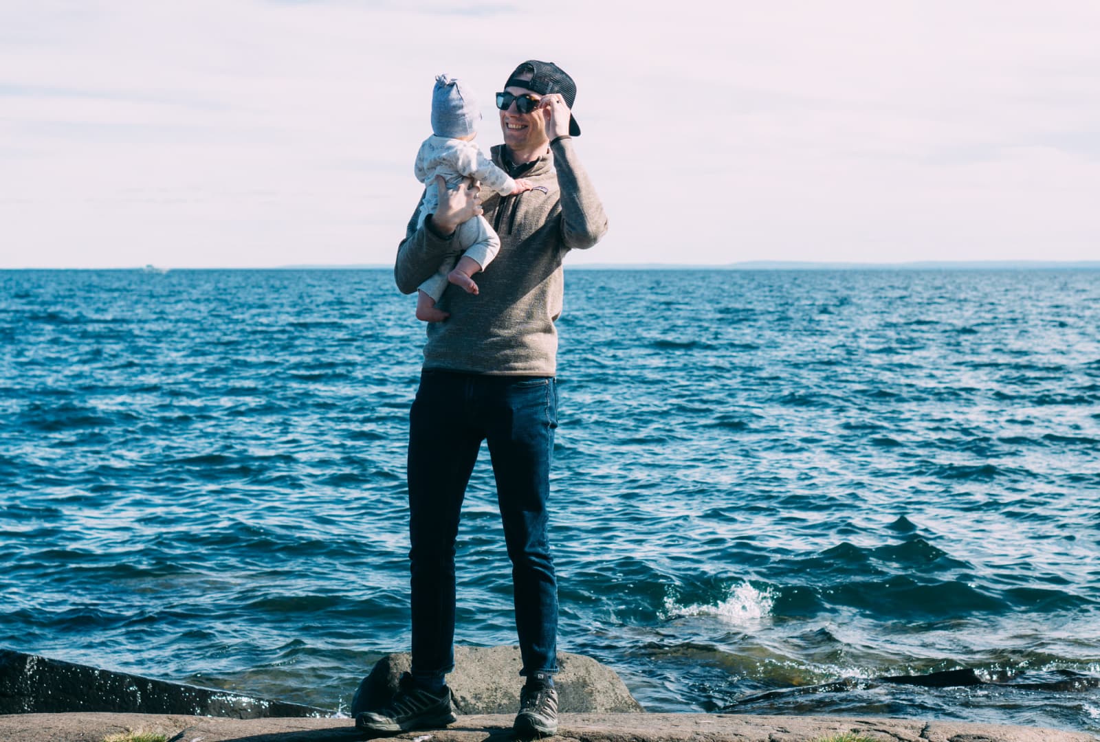
Hey everyone! I hope you all got a chance to explore last week and get some editing done. This week I was able to try my hand at concert photography and it was a blast! Did you try anything new? If so, send me an email with a link to what you shared! I’d love to see what you did!
(p.s. If you just want to get to the pictures keep scrolling to “This Week’s Edits” !)
Reader Responses – Spot Removal and Photoshop Fix vs. Lightroom / Photoshop
I also had fun reading your responses to the first email and I hope to get a chance to read more like this:
“Loved the use of photoshop fix. Never knew what to really use it for, but now I see it’s a useful tool.”
– @ka.schulze
Seriously, that made my day! Anytime I can introduce (or in this case re-introduce) someone to a tool to make their photos look better makes me super happy!
Speaking of Photoshop Fix, last week I mentioned that Photoshop Fix on my iPhone does a better job of removing spots / unwanted things from your photo (like a coffee stain on a mug or a piece of dirt on a lens).
However, I need to amend that statement because this week I realized 1) why it worked so well and 2) a lesson to apply to spot removal in Lightroom or any other photo editing program.
I think the reason spot removal works so well in Photoshop Fix is not because the program is better, but because of how I always type “i” instead of “o” on the iPhone keyboard.
Think about it. Because you’re limited to the pretty blunt and imprecise brush that is your fingertip I always end up zooming in really far when removing something. So ironically, that actually ended up making my selection more precise and therefore making it much easier for the algorithm behind spot removal to come up with something that blended seamlessly into its surroundings.
In Lightroom however, I was doing the exact opposite. Because I have the precision of a mouse, I would only consistently zoom in to 1:1 (100%) or maybe 2:1 (200%) if something seemed tricky. Whereas on my phone I might be zooming into the equivalent of 8:1 or more. So in that case my precision pointing instrument was being used to select an area much larger than it needed to be.
So, this week I went back to Lightroom and zooming in much further (think 8:1) and I’m happy to say that spot removal works even better than I thought in Lightroom and is still awesome in Photoshop Fix.
The lesson as always…never assume that the way you’ve been doing things is the way you should keep doing things! But hey, in this case you get to benefit from my mistakes! – Josh
This Week’s Edits – October 21, 2016
As I’ve mentioned before this email is a work in progress and will probably evolve a lot week-to-week. A big change I’m going to make already is to cut down from 5 photos to 3. I think that will keep this shorter, easier to digest, and allow me the flexibility to go more in depth if I want like I did this week for photo #2.
So, for now here’s what to expect:
- Once a week (Fridays?) you’ll get an email from me with 3 photos.
- 2 of the photos will be from me and 1 will be from a guest photographer (I’m lining up some good ones for the future).
- Each photo will have a before (straight out of the camera) and after (final edited version).
- I’ll list out the major edits made to the photo so you can recreate the look yourself!
Apps Used This Week:
Adobe Lightroom CC ($9.99 / mo), VSCO (iOS, Android), Instagram (iOS, Android), Adobe Photoshop Fix (iOS Only)
#1:
Camera: Sony A6000
Location: Baxter’s Hollow State Natural Area near Baraboo, WI
Software: Lightroom
Click here to see the post on Instagram.
EDITS
Lightroom:
- Preset: VSCO Film 05 Kodak Ektar 100
- Exposure: -.30
- Highlights / Shadows: -35 / +30
- Whites / Blacks: -30 / +30
- Saturation: -5
- Sharpening: +21
- Noise Reduction: +14 (Luminance)
NOTES
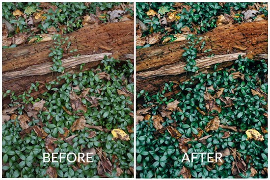
I took a photo a lot like this a few years ago at Tower Hill State Park and have that one hanging in my office. Something about the deep, dark waxy greens really speaks to me. However, as you can see those deep greens are not what came out of the camera at all! In this case VSCO Film 05 allowed me to bring out the deep greens that the mid-day haze had washed out. Another important thing to note is the almost complete balance between lightening the shadows and darkening the highlights. Along with a slight decrease in exposure this is what really brings out the dark spaces between the leaves without the image getting too dark. Try this the next time you’re editing in Instagram.
#2:
Camera: Sony A6000
Location: Pewits Nest State Natural Area near Baraboo, WI
Software: Lightroom
Click here to see the post on Instagram.
EDITS
Lightroom:
- Preset: VSCO Film 05 Kodak Ektar 100
- Exposure: +1.9
- Highlights / Shadows: -35 / +30
- Whites / Blacks: -30 / +15
- Saturation: -5
- Sharpening: +21
- Noise Reduction: +5 (Luminance)
Instagram:
- Brightness: +18
- Contrast: 10
- Structure: +8
- Warmth: +21
- Saturation: +6
- Highlights / Shadows: -58 / +59
- Cropped and Straightened
- Exposure
NOTES
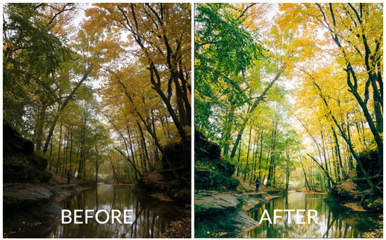
This one is a doozy! I know there are a lot of edits here that might make it seem like I completely changed the look of this picture from real life. However, if you’ve ever taken a photo while hiking in a beautiful forest you’ve probably run into the problem of having to pick how to expose the photo. If you focus on the bright sun peeking through the leaves suddenly the whole scene becomes dark and gloomy to compensate. However, if you focus on the darker areas the whole photo becomes washed out and all those great colors are gone. So, what do you do?
On your iPhone this is a great chance to turn on the HDR feature. It takes two images (one using the bright area and another with dark areas) and combines them to one image. This will give you a much better base to start out with.
However, as great as that feature is…this is a perfect example of how a DSLR / Mirrorless camera (in this case the Sony A6000) can do a much better job of capturing what you actually saw (or what your brain told you that you saw).
With a total ability to capture a range of light around twice your phone (combined with shooting in RAW) you end up with a much better editing pallet to do in post what your brain does automatically (aka brighten, bring up the shadows, lower the highlights).
#3: Guest Photographer @stasiaharoldson
About Stasia Haroldson:
Real life got in the way this week and since I’m building this on the fly, my wife gets to be the guest photographer again! The “perks” of being married to me, right Stasia? Anyway, if you want to get to know her better, why not listen to Season 1 of our podcast, Our First Drink: Conversations with Interesting Couples, where you can hear her be much funnier than me.
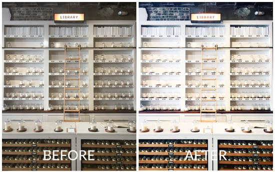
Camera: iPhone 6S
Location: Candlefish, Charleston, SC
Software: VSCO
Click here to see the post on Instagram
EDITS
VSCO:
- Preset C2 +7
- Temperature -1
- Sharpen +7
- Contrast +1
- Exposure +1
NOTES
“When I saw this wall of candles while visiting Charleston, SC, I was so excited – it had so much interesting detail. The challenge, though, was all the lines – each one needed to be straight in order to have the best visual impact. This is such a key part of my editing process. I do all my adjustments of this kind in the Instagram app and not in VSCO – I find Instagram to be much easier to use because of all the extra gridline levels they provide. To toggle between all the gridline options, just tap on the four “crossed” lines in the top left of the “Adjust” menu inside Instagram.”
– Stasia Haroldson
And we’ve made through 2 weeks! Don’t forget to let me know if you have any feedback, questions, or suggestions by replying to this email!
It might take me a couple days, but I really do read and reply to all of them!
See you next Friday! Now go do something that makes you excited!
-Josh
@joshharoldson

